 +1 (201) 350 1135

And Google’s biggest change in the online search industry is almost here…
It’s the much-awaited Google Mobile-First Index Algorithm. While Google has not yet launched the update officially, it impacts is clearly visible.
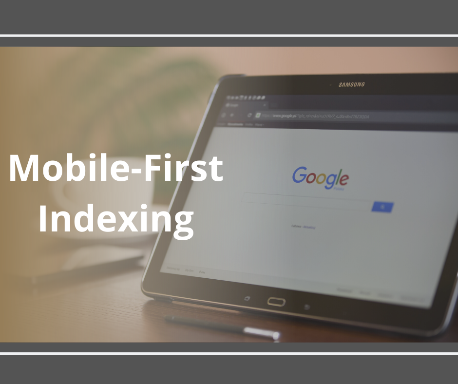
What is “Mobile-First Indexing”?
As the name suggests, the mobile-first index update means Google will now rank websites based on their mobile version only. While the desktop sites will not experience any penalty, their rankings would greatly suffer.
Mobile-first indexing is exactly what it sounds like.
As the name suggests, mobile-first indexing is all about a mobile-friendly website and how it can rank well.
The mobile version of your website is something that Google considers as a plus point and includes in its index at the first point.
It just means that the mobile version of your website becomes the starting point for what Google includes in its index and the baseline for how Google determines a website’s rankings.
If you keep on monitoring crawl bot traffic to your site, you may analyse the increase in traffic from your smartphone.
Well, the desktop site can still be included in the index, but the lack of a mobile-friendly experience could impact negatively on the rankings of that site, and a site with a better mobile experience would potentially receive a rankings boost even for searchers on a desktop.
So, if you still do not have a mobile version of your websites, it’s time for you to tie your shoelaces to avoid a great fall!
According to the Google Webmasters Blog:
Accessing the internet via smartphones has grown exponentially in the last few years and has overtaken desktops. Therefore, it is no surprise that Google is changing everything and prioritizing the mobile versions of websites. The skyrocketing searching on mobile devices means Mobile-First Indexing is going to have a big impact on the traffic to many websites.
“To make our results more useful, we’ve begun experiments to make our index mobile-first. Although our search index will continue to be a single index of websites and apps, our algorithms will eventually primarily use the mobile version of a site’s content to rank pages from that site, to understand structured data, and to show snippets from those pages in our results. Of course, while our index will be built from mobile documents, we’re going to continue to build a great search experience for all users, whether they come from mobile or desktop devices.”
The Result: Webmasters who have a website optimized for mobile will rank well on both mobile and desktop. However, if your website doesn’t perform well on the mobile, it will drop your site rankings on both mobile and desktop.
What E-marketers can do About It?
While Google’s new update is not expected to fully roll out for another few months and is being tested thoroughly, this doesn’t mean that webmasters can sit back and relax. It is advisable for them to get ready for the major changes that are coming sooner rather than later.
Here are the things you can do to prepare your website to face the mobile-first indexing like a Hero:
SEO for Mobile
1) Have a Mobile-Friendly Website:
Is your website responsive? A responsive design means that users can view and interact with your website on mobiles or other smart devices irrespective of their screen sizes, i.e., your website is smart or responsive enough to adjust itself depending on the size of the screen it is being viewed on. Further, this enhances the user-experience of those who are accessing your website from different devices.
2) Create Mobile-Friendly Content:
Besides the website look, businesses should also ensure that their content is mobile-friendly. To ensure your content is as responsive and mobile-friendly, you will have to understand your user behaviour and their preferences.
For your users to stay longer on your website, feeding them high quality and engaging content will be a great idea. Hence, develop high-quality content like audios, videos, images, etc., that tells stories.
3) Work on the Site Speed:
Undebatable, your site speed is an essential thing to consider in order to improve usability, and a longer stay especially on the mobile. Google already considers page speed when it comes to rank a page and it will continue to do so when the mobile-first index is fully released.
To achieve this, test your website in Google’s PageSpeed Insights Tool and check if your site is loading in around three seconds. If not, look into the reasons behind this and optimize your site for the same.
4) Internal Linking:
Proper internal linking on mobile is a must to ensure that your users don’t struggle to navigate for accessing particular information that can be easily discovered on the desktop version of your site. Same can happen when Google crawls the mobile website.
Hence, it will be important that the internal linking on the mobile site closely replicate the desktop to prevent a drop in your site rankings.
How to Prepare Your Site for Mobile-First Indexing
Mobile-first indexing is ultimately about the mobile-friendliness of your site. A combination of the right tools and your own experience will help optimize the site for mobile.
The right tool—A good tool for assessing how well your site functions on mobile devices is Google’s own Mobile-Friendliness Tool. If Google finds things that hinder a mobile experience on your site, it will tell you what they are so you can get your web dev team to work.
Your own experience—Additionally, take a few minutes to pull up your site on your own mobile device and navigate through it. Click on links, fill out forms, etc. Just because Google doesn’t find technical errors or common display issues, doesn’t mean the site provides the best mobile experience that it could.
Experiencing and working with the site on your own mobile device—and asking your team or a few friends to do so on their devices—will provide insights that no mobile simulator can generate. You don’t just want your mobile site to be compatible, you want it to be the best.
Common questions about mobile-first indexing:
When did mobile-first indexing begin?
It all started in November of 2016 as Google first announced the idea of mobile-first indexing. Moving forward nearly after a year John Mueller said that testing for mobile-first indexing had just gone live. Intending to release it in batches, many of the first sites were desktop-only sites which made perfect sense. It meant that sites having only one version would be the easiest to carry over as there were no discrepancies between mobile and desktop.
Is mobile-first indexing all about adding mobile pages to a separate mobile index?
In the case of mobile-first indexing, there is only one index and it’s the one that Google uses now. The changes in mobile-first indexing do not generate a new “mobile-first” index, nor is it about creating a separate “mobile index” with a “desktop index” remaining active. Instead, it simply changes how content is added to the existing index.
What if I don’t have a mobile version of my site?
If you don’t have a mobile-friendly version of your website and even your desktop version is not mobile-friendly, your content can still be indexed by Google. However, you may not rank that well when compared to other mobile-friendly websites.
Not owning a mobile-friendly website may in-turn negatively impact your overall rankings on desktop search as well as mobile search results because it will offer poorer user experience than other mobile-friendly sites.
Will this change the Google rankings in a big way?
Both Gary Illyes and Paul Haahr from Google said that it’s something that should definitely not affect the overall rankings. In fact, they want there to be minimal change in rankings around this update. But, of course, it is too early to tell, they said — but their goal is not to have this indexing change impact the current rankings too much.
Can I see the change and the impact in the search results now?
Google said that individuals shouldn’t be able to see the change and impact of the mobile-first index rollout. In fact, according to Google, there is little to no impact after this update is fully rolled out. Moreover, Paul Haahr said, “I would be very surprised to detect any effects of mobile-first indexing at this stage.”
Mobile-First Indexing Myths
Myth 1: Mobile-first indexing directly impacts rankings.
Google’s priority is to make sure that the change is quite seamless and that your rankings are not negatively impacted.
Myth 2: Mobile-first indexing is the same thing as mobile-friendliness
There’s no denial to the fact that Google confirms these two items are completely independent of one another. Mobile-friendliness is quite important as it is still used as a ranking factor, but it is a completely different thing from mobile-first indexing. Many sites that are not mobile-friendly have been moved to mobile-first indexing.
Myth 3: Keeping your site in poor quality is a smart strategy for helping you avoid the transition.
In fact, in a world of rapid updations and high competition, it doesn’t make any sense to prohibit your growth and it’s something Google agrees with.
Additional Mobile-First Indexing Tips
1. Consider switching to responsive design (if you don’t have one already).
Moving to a responsive web design eliminates the headache of operating two independent versions and allows content to be a match on both desktop and mobile.
2. You no longer need to be afraid of hiding stuff behind tabs.
Google has said this in the past too that content behind the tabs holds quite less weight but this will be less of a factor for mobile-first indexing moving forward. Google is getting much better at handling this type of content but hasn’t reached quite at the point where you can hide valuable information. It’s still important to keep in mind that if the content is shown “on click”, crawlers will not be able to access it if shown through JavaScript actions.
3. No more Flash!
Make sure to avoid serving content through flash as it is quite incompatible with mobile devices. Most of the features of flash can now be emulated through markups and coding technologies also.
4. A reminder to update your disavow file.
A great reminder from John Mueller via Glenn Gabe early in July conveys that a lot of sites have been moved over to mobile-first indexing if you run an m.dot page make sure that you have uploaded your file for it as well.
5. Ensure your mobile version has important, high-quality content.
Google has suggested that it includes “text, images (with alt-attributes), and videos in the usual crawlable and indexable formats.”
6. Structured data is important for indexing and search features that users love says Google.
It should be both on the mobile as well as the desktop version of the website. Moreover, ensure that URLs within the structured data are updated to the mobile version on the particular mobile pages. We love Luke Carthy’s pro tip from May of 2019 which discusses the best way to test this. He advises you to paste in the HTML from GSC’s live inspection rather than the URL since Google’s Structured Data Testing Tool relies on a desktop bot, but Google itself uses mobile fetched structured data. This means you’ll get a much more accurate understanding of what Google’s recognizes.
In terms of priority types, Google says that you should place a priority on Breadcrumb, Product, and VideoObject structured data. For all other types of structured data, check out schema.org.
7. Metadata should be present on both versions of the site.
It provides valuable hints about the content on a particular page for indexing and serving. For example, you need to ensure that titles and meta descriptions are equivalent across both versions of all pages on the site.
8. Let Google crawl your resources.
If you have resources that have different URLs on mobile and desktop, be sure to check that you’re not blocking URLs with the disallow directive.

Share this Image On Your Site
Have you started preparing for the mobile-first indexing update? If you are still confused, contact SEODiscovery today!
Add a Comment